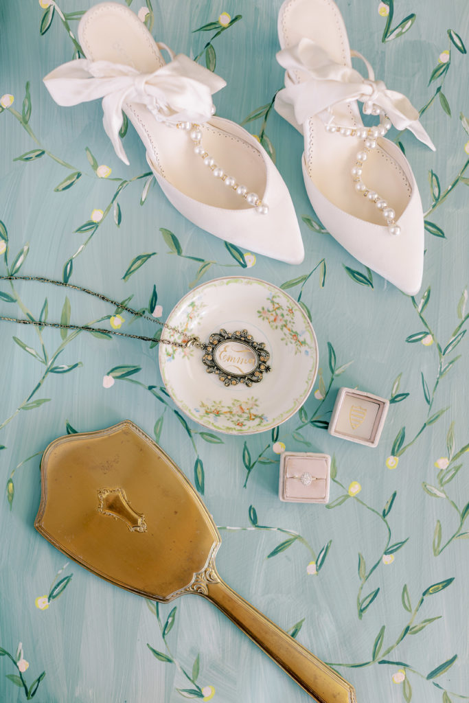
Let it be known that I am not a lay flat design master.
I am not.
… but I have been obsessed with the beauty of laying out the paper goods and other sweet items into a design that looks both visually appealing and captures the beauty of the goods, and I wish it had been a thing when I got married almost 10 years ago.
if you’re new to the concept, a flat lay is simply a way to show small items like an invitation shite or the rings artfully. I didn’t know what it was until I started working with weddings!
What is it?
These flat or “not flat” lays can capture a different kind of beauty. It can show something really special and unique and allows a photographer to really practice some special skills that they wouldn’t sometimes otherwise get it to use.
As an artist I know that it is not an easy task creating the perfect lay flat design.
It takes serious skill to achieve the perfect work that tells the story of the wedding and it’s still unique to each wedding.
No one wants a flat lay wedding invitation suite that looks the same as their best friends.
So, something I’ve been playing with for the past six months has been flat lay mats. Some are abstract in style and some are leaning more towards the chinoiserie style.
Some are patterned, some are not, and I think that the unique mat can help enhance the way we as wedding professionals tell your wedding story.
You deserve a totally unique remembering of your unique wedding that tells your unique story.
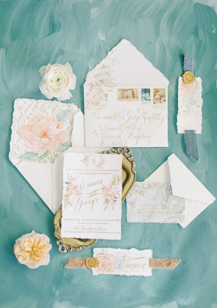
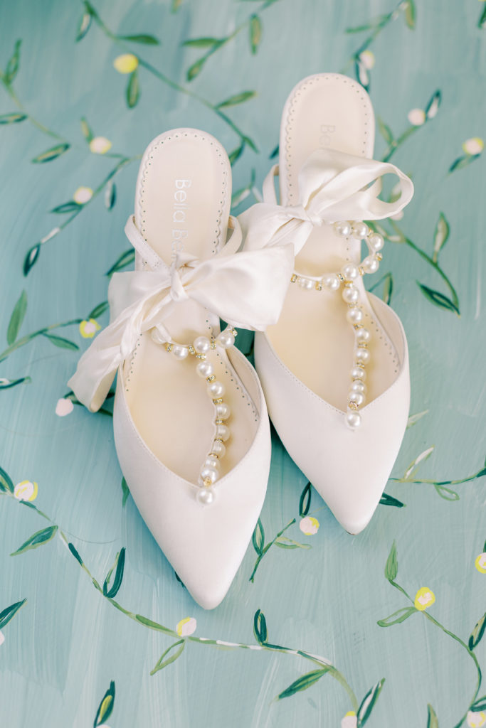


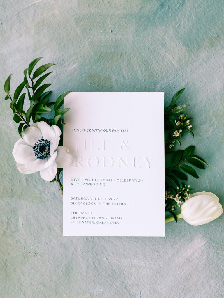

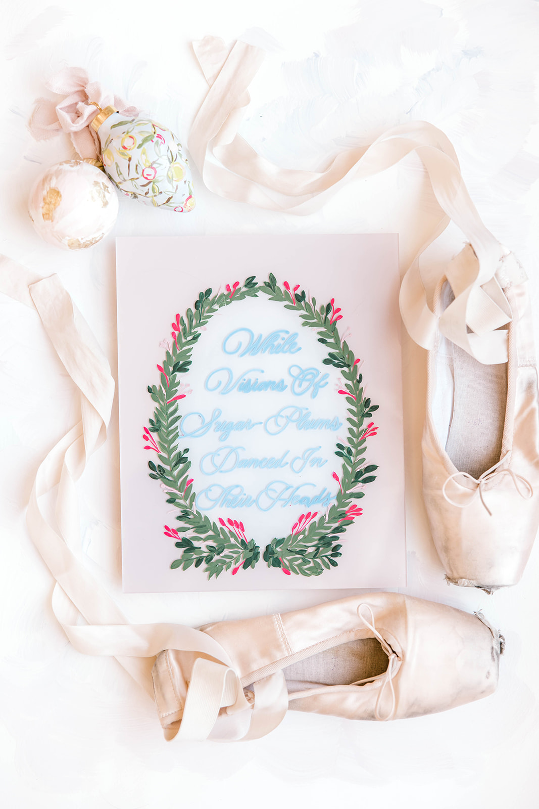
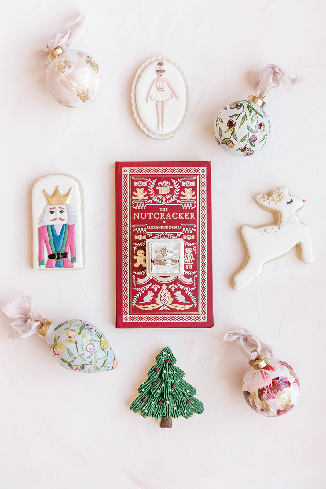
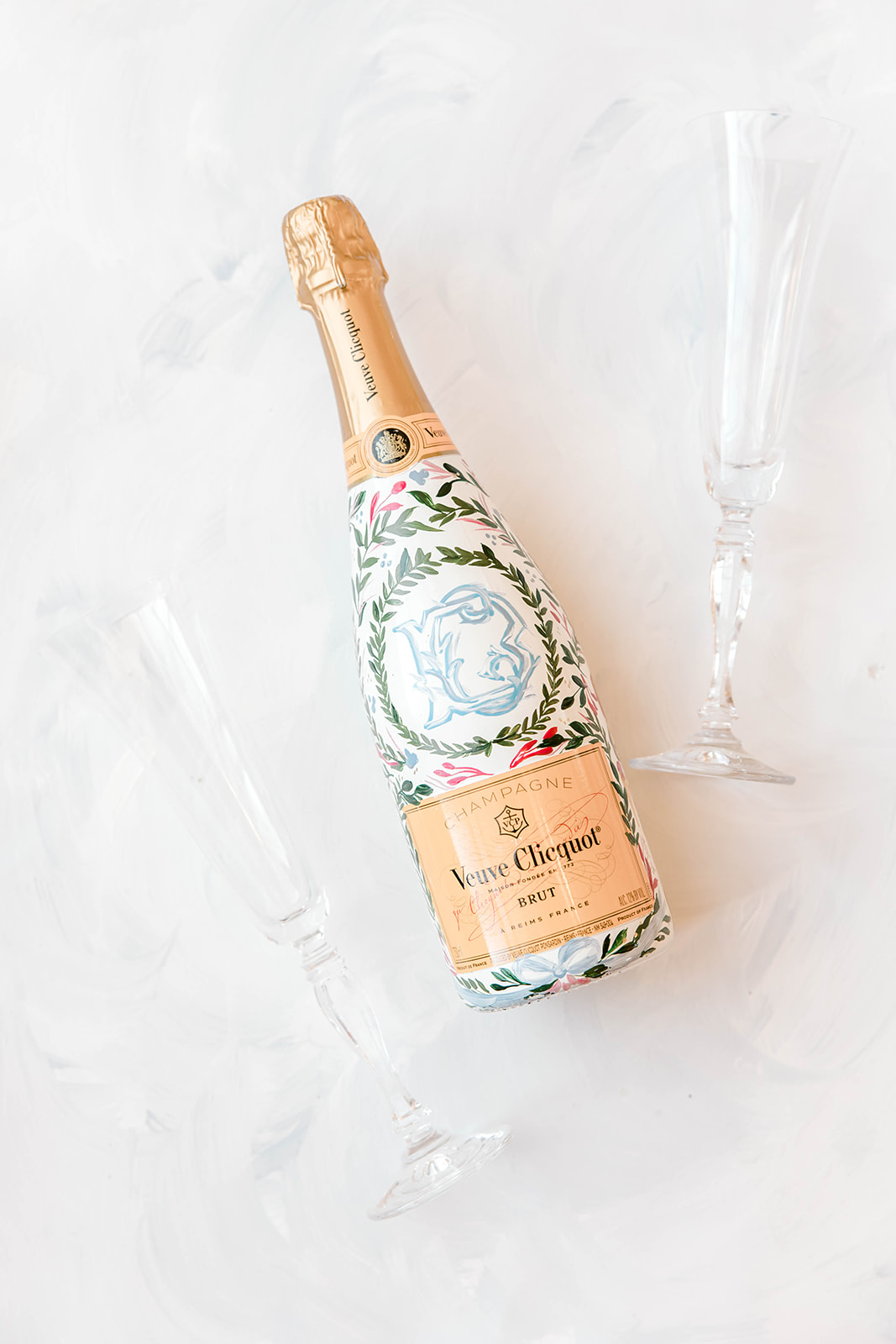
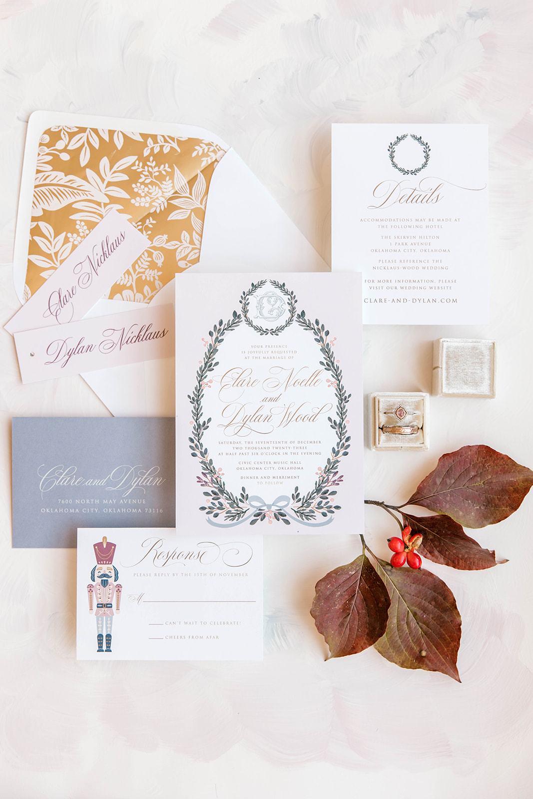
I asked my resident FLAT LAY EXPERT, a.k.a. Meg Rose Photography, to share three tips for styling the perfect flat lay.
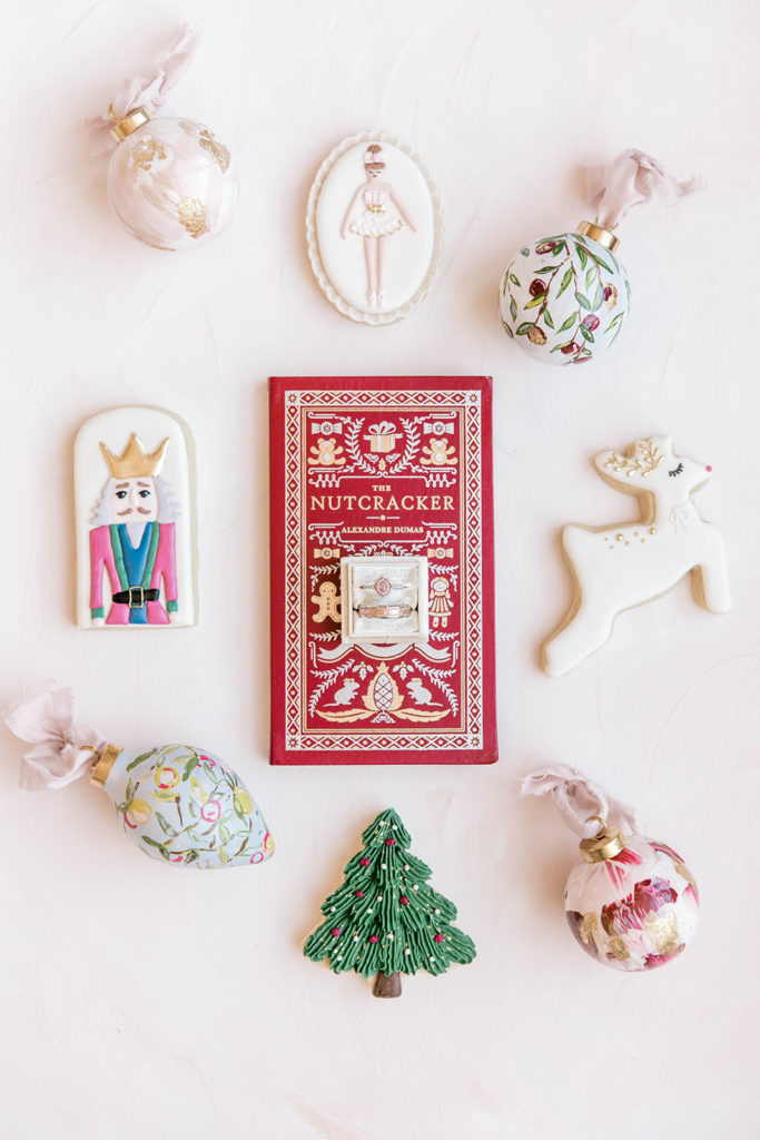
I got to work with Meg on this GORGEOUS Nutcracker-inspired winter wedding editorial at Civic Center Music Hall, and she is so gifted at styling the perfect flat lay. She also was the first person be say YES to using my flat lay mats.
Cue the confetti!
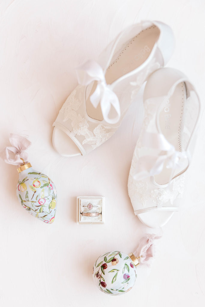
I mean, seriously. The Bella Belle shoes with my custom heirloom ornaments, that BC Clark ring and the The Mrs. Box ring box? A dream set up.
BESPOKE TIP #1
Add depth and dimension to paper products by using lens caps or small acrylic blocks underneath paper.
BESPOKE FLAT LAY TIP #2
Use styling details such as real florals, silk ribbon, or vintage stamps to add texture and really elevate a flat lay design.

BESPOKE TIP #3
Photograph by a window for natural light and use a white foam board to bounce light from opposite side for an even lit flat lay.
I use these tips when I take photos for my own products and launches. Getting near that window is one of the *most* helpful and easiest ways to get beautiful natural light that shows the *actual* colors of what you’re photographing.
Interested in a bespoke flat lay mat to up-level your game?
Here’s some features and benefits you may be interested in:
01. Each mat comes with blocks to hold the mat steady and a tube with handle for moving safely to and from weddings. You all have a lot to carry – let’s make this easy for you.
02. They are sealed with clear matte varnish. If taken care of, they will last a lifetime on canvas.
03. Your fine art backdrop is ready to use as soon as it arrives
It’s so easy!
Tap here to get on the waitlist.
“Courtney’s flat lay mats take your detail photos to the next level!!
I have used many style mats over the years as a wedding photographer, Courtney’s handmade mats provided the romantic fine art feel I was longing for!!!”
—EMILY NICOLE WATKINS,EMILY NICOLE PHOTO
